Around this time last year, I published a review of NDepend. They contacted me around June and asked me to have a look at version 6. The following is my current personal opinion of this new product.
Background
After the last time I did a similar review, I pretty much didn’t continue to use the tool. What this means, is that coming back to it now, everything is new to me again. It also means that I haven’t “gotten used to” the little gripes that I had the first time round.
Also, one of the reasons that I stopped using it last time was that the windows didn’t dock (or they did, but they didn’t stay docked), so they kind of got in the way.
What’s new?
One or two of my gripes from the original post have been addressed. This always pleases me - even if it had nothing at all to do with my suggestion; the product is alive and being improved. Amongst the features that intrigue me most were the dependency … squares, the docking (which now works), code coverage and the VS integration changes.
Dependency
IMHO, the problem that the maker(s) of NDepend face, is that their core product is, by its very nature, used once. I come to an application and I want to see a dependency graph. I might want to see another one in a few months, but once I’ve seen a dependency graph, I’ve seen it. The way that Patrick and the team have addressed this is to add additional features that don’t directly relate to dependency. Obviously, this is a two edged sword: on the one hand, people are unlikely to buy more than one licence for a product that generates a dependency graph; on the other, if it becomes too heavy, people may not want the additional features.
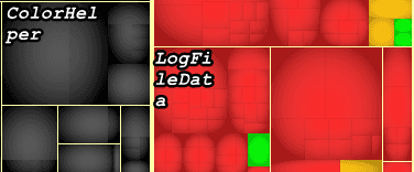
The new feature on Dependency seems to be that the “Square Map” (this isn’t what it’s called, but it’s as good a name as any) is now colour coded. This certainly makes the graph easier to see, and there is a tooltip, which explains exactly what you’re seeing; so that’s all good. However, I have a few issues here. If I select that I want to see a code coverage graph, then I definitely get one:
So, what this tells me it tells me (by default) is that the large squares are the more complex or larger methods, and the red ones have test coverage. What it apparently actually tells me is that grey squares can’t be analysed, green have test coverage and red do not. I would have included a screenshot to this tooltip, but it’s very elusive.
The tooltips have been improved, but they still get in the way, and it’s hard to know how this could be improved.
Next, I can select a different graph, and this seems to change the colour; however, the tooltip remains the same, so it’s difficult to know exactly what it has done. My suspicion is that it’s altered one axis of the graph from coverage to, say, method size.
Double clicking the squares takes you to the relevant code, and there is a drop down menu that does allow to you change what’s being shown. Getting back to dependency, one of those options is “Methods calling me”. It’s a quick way to identify the most used areas of the system.
With a bit of playing, I presume I could produce a graph showing the most popular methods with no test coverage:
(from m in Methods
where m.PercentageCoverage == 0
orderby m.Rank descending, m.NbMethodsCallingMe descending, m.NbLinesOfCode descending
select new { m, m.Rank, m.NbMethodsCallingMe, m.NbLinesOfCode }).Take(100)
It is, admittedly difficult to tell whether this works or not, but it seems to at first glance.
Code Coverage
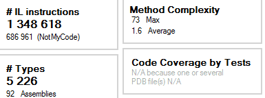
Since the last time I reviewed this, I’ve started using VS Premium, which means that I can use the code coverage analysis in NDepend. The process for this is a little cumbersome: export the coverage file from VS and then import into NDepend. There seems to be some issues with this; for example, when I ran the analysis:
But:
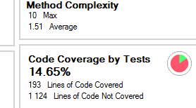
I clearly have code coverage - VS says so:
My suspicion is that NDepend has a problem with any solution containing non-C# files. Running this against a C# only project results in:
Even with this, the default charts seem to have some… issues:
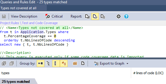
However, as I’ve come to expect from NDepend, the power is not in the default charts, but in the analysis that you can do with the default and custom queries; for example:
I can then start messing with the figures, and ordering and extracting, etc…
Having said all that, it’s very disappointing that, once it apparently sees a VB.NET project it just gives up and goes home.
Visual Studio Integration
One of my favourite plug-ins for VS is Stop Build On First Error. If you have a solution of any size or complexity, it’s an absolute must. NDepend seem to have … err… borrowed this idea and incorporated it. Since I have this plug-in anyway, it does give me a reason to always keep NDepend around.
Conclusion
I haven’t been using this over the past few months, so I suppose the question is: will I because of these changes?
I probably would, but I can’t. The main project that I work on contains VB code, which I believe is stopping me from using the code coverage analysis, and I feel this, combined with the dependency data is the main feature. I think NDepend is now useful enough to keep installed; however, it’s not really something to use on a day-to-day basis. If you come to a new code-base, or you’re refactoring then it’s definitely worth having. It seems to be a product in development, so I imagine it will continue to improve.
I suppose if I could request anything for the next version it would be that it either works with, or just ignores VB code. And the killer feature would be if it would work with a SQL DB, too. Identifying what tables are used where in a solution would be excellent.
