Having recently released my latest app into the store, I noticed that some of the buttons didn’t fit well on the phone version. I’d already come across translations for the HTML/WinJS version of Windows 8 apps, but not the XAML version, and not Windows 10 UWP.
You can do this in Expression Blend
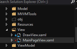
First, double click the view file:
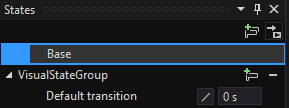
In the States window, you’ll then have the ability to create a new VisualStateGroup:
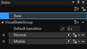
Create the required states; here’s mine:
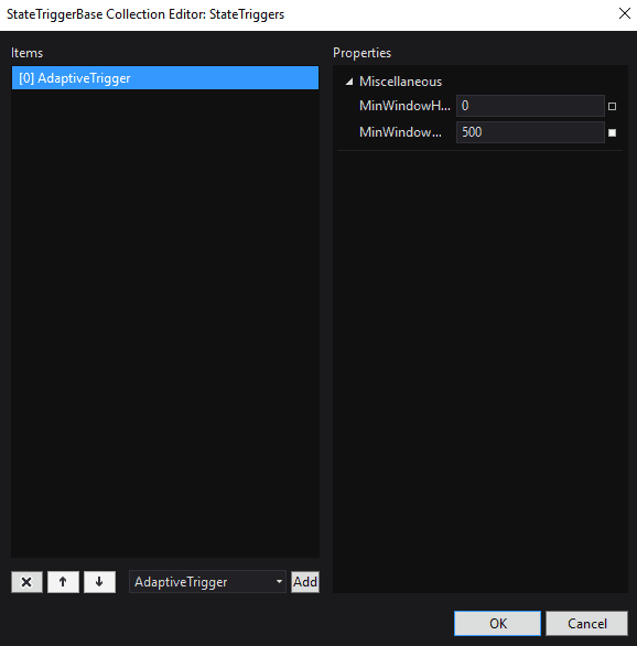
If you click the lightning bolt to the side of the group, you should get the following:
If you create an adaptive trigger as above, you’ll be able to set the minimum width or height for the change. I’ve set the minimum width for desktop form factor to 500.
Back to code
What that produces for you (remember that you can alt-tab between Blend and VS and it should deal with the changes relatively gracefully) is a piece of code along the lines of this, within the XAML view:
    <Grid Background="{ThemeResource ApplicationPageBackgroundThemeBrush}">
        <VisualStateManager.VisualStateGroups>

            <VisualStateGroup x:Name="VisualStateGroup">

                <VisualState x:Name="Normal">
                    <VisualState.StateTriggers>
                        <AdaptiveTrigger MinWindowWidth="500"/>
                    </VisualState.StateTriggers>
                </VisualState>

                <VisualState x:Name="Mobile">
                    <VisualState.StateTriggers>
                        <AdaptiveTrigger MinWindowWidth="320"/>
                    </VisualState.StateTriggers>
                    <VisualState.Setters>
                        <Setter Target="tgPlay.(Grid.Column)" Value="0"/>
                        <Setter Target="tgPlay.(Grid.Row)" Value="1"/>
                        <Setter Target="btnCommandCreateVideo.(Grid.Row)" Value="1"/>
                        <Setter Target="btnCommandCreateVideo.(Grid.Column)" Value="1"/>
                        <Setter Target="btnCommandClear.(Grid.Row)" Value="1"/>
                        <Setter Target="btnCommandClear.(Grid.Column)" Value="2"/>
                        <Setter Target="numericUpDown.(Grid.Column)" Value="0"/>
                        <Setter Target="numericUpDown.(Grid.Row)" Value="1"/>
                        <Setter Target="numericUpDown.(Grid.ColumnSpan)" Value="3"/>
                    </VisualState.Setters>
                </VisualState>
            </VisualStateGroup>
        </VisualStateManager.VisualStateGroups>
There’s a number of points here - the first is that you need to name your controls; that’s how they are referenced. If you use Blend and you don’t do this then blend will give them a name; for example, I didn’t give “numericUpDown” a name. If I had another control of the same type then it would just number them.
The second point is the adaptive trigger. 500 and 320 seem to be the generally accepted divisions between desktop and narrow form factor. This approach worked for my specific requirement, although what Blend produces does require some re-work, otherwise it just ends up as a mess.


