Having looked at CSS in the past, and thought that it’s probably something that people who are better at UI design that me should concern themselves with, I’ve recently been playing with it while looking at the new Dot Net Core web apps.
The problem that I’m looking at in this particular article is how to overlay one control on top of another. I have no doubt that there are dozens of possibilities; but the two specific ones that I’ll be focusing on are positioning absolute and relative.
Target
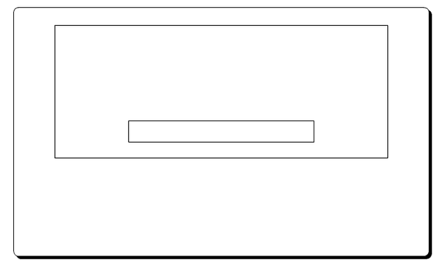
The idea here is for a web-page that looks like this:
HTML
The HTML is pretty basic for this:
[code lang=“html”]
# CSS: absolute positioning

We have the basic elements, so now it's down to CSS to make the screen above.  By default, web browsers will render the div's sequentially, and so the input box will appear below the image.

One possibility is to use "absolute" positioning.  This means that I can position an element without regard to where other elements on the page might be; here's an example:

[code lang="css"]
.overlay {
    position: absolute;
    top: 30%;
    text-align: center;
    z-index: 10;
}

img {
  background-color: blue;
  width: 100%;
  height: 500px;
}
I’ve used 30% here because it matters on the size of your viewport - so that’s not ideal. Also, the centre align doesn’t work. This kind of makes sense when you think about it, because you’re using an absolute position - so what do you want to centralise it to?
CSS: relative positioning
Relative positioning took me a while to work out. It sounds like it’s relative to something else - but it’s actually relative to itself. Here’s what I tried for relative positioning:
[code lang=“css”]
.overlay {
position: relative;
width: 80%;
height: 35px;
top: -50px;
border: none;
text-align: center;
z-index: 10;
}
As you can see, it's top position is negative, so it moves up from where it would have been.  Also, because the positioning is relative, the centre align now works, because it's back in the flow of the page.

# References

[https://css-tricks.com/absolute-relative-fixed-positioining-how-do-they-differ/](https://css-tricks.com/absolute-relative-fixed-positioining-how-do-they-differ/)

[https://www.w3.org/Style/Examples/007/center.en.html#block](https://www.w3.org/Style/Examples/007/center.en.html#block)